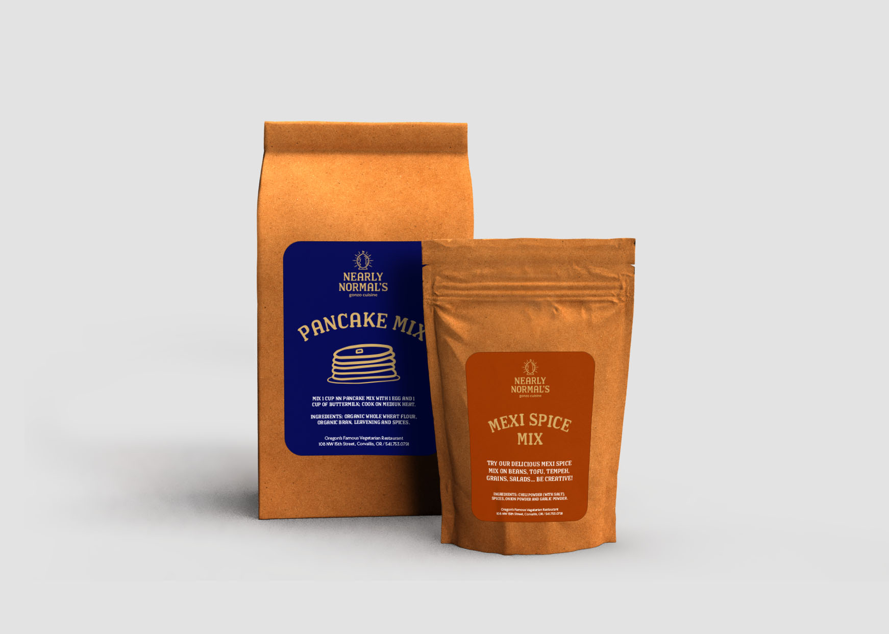
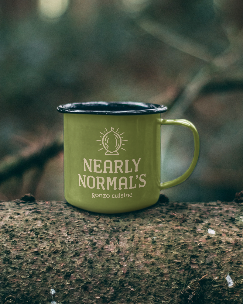
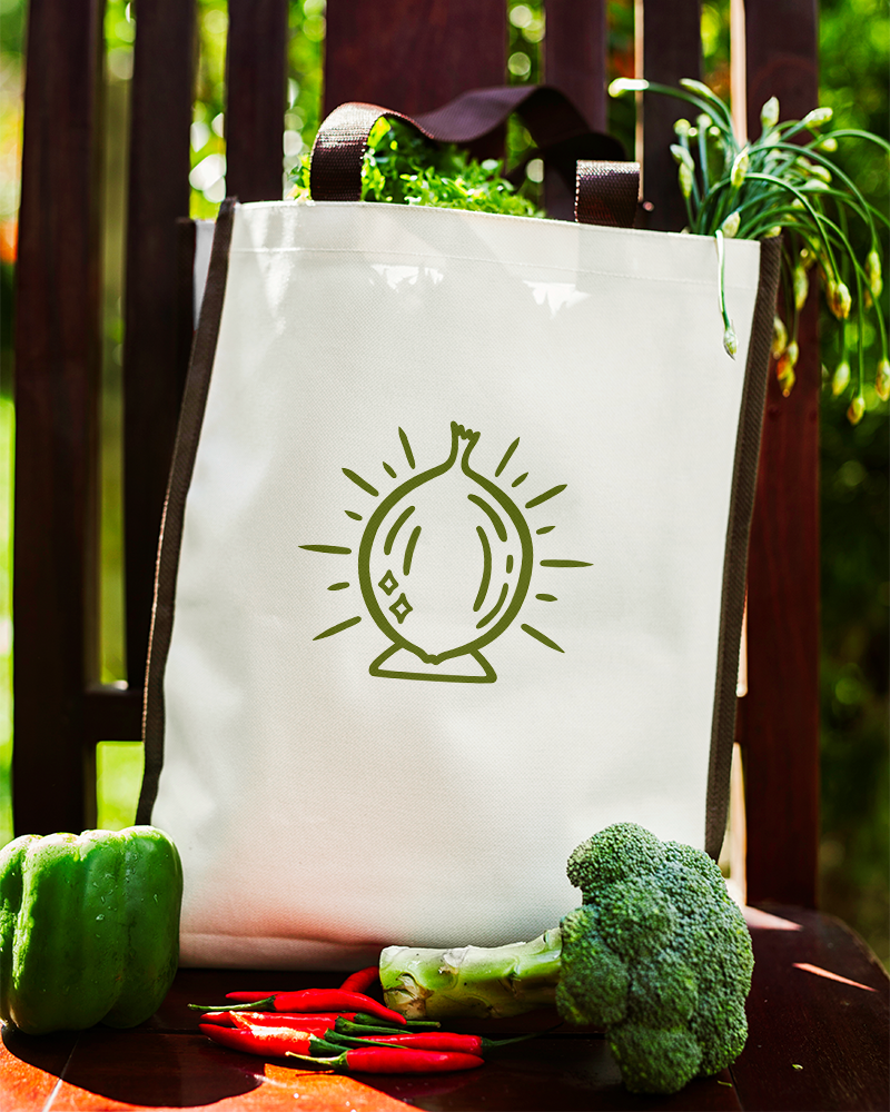
A (fake) rebrand of a quirky vegetarian restaurant that is local to Corvallis, Oregon. Nearly Normal's has been a staple in the Corvallis community for over 30 years. They are well known among local veggie lovers, but current branding is almost nonexistent and does not match the quality of the products. My rebrand provides Nearly Normal's with some much needed consistency while still evoking the whimsical nature that is evident in their food and dining experience. The signature mark is an onion that takes on the character of a crystal ball, creating a feeling of intrigue and wonder.
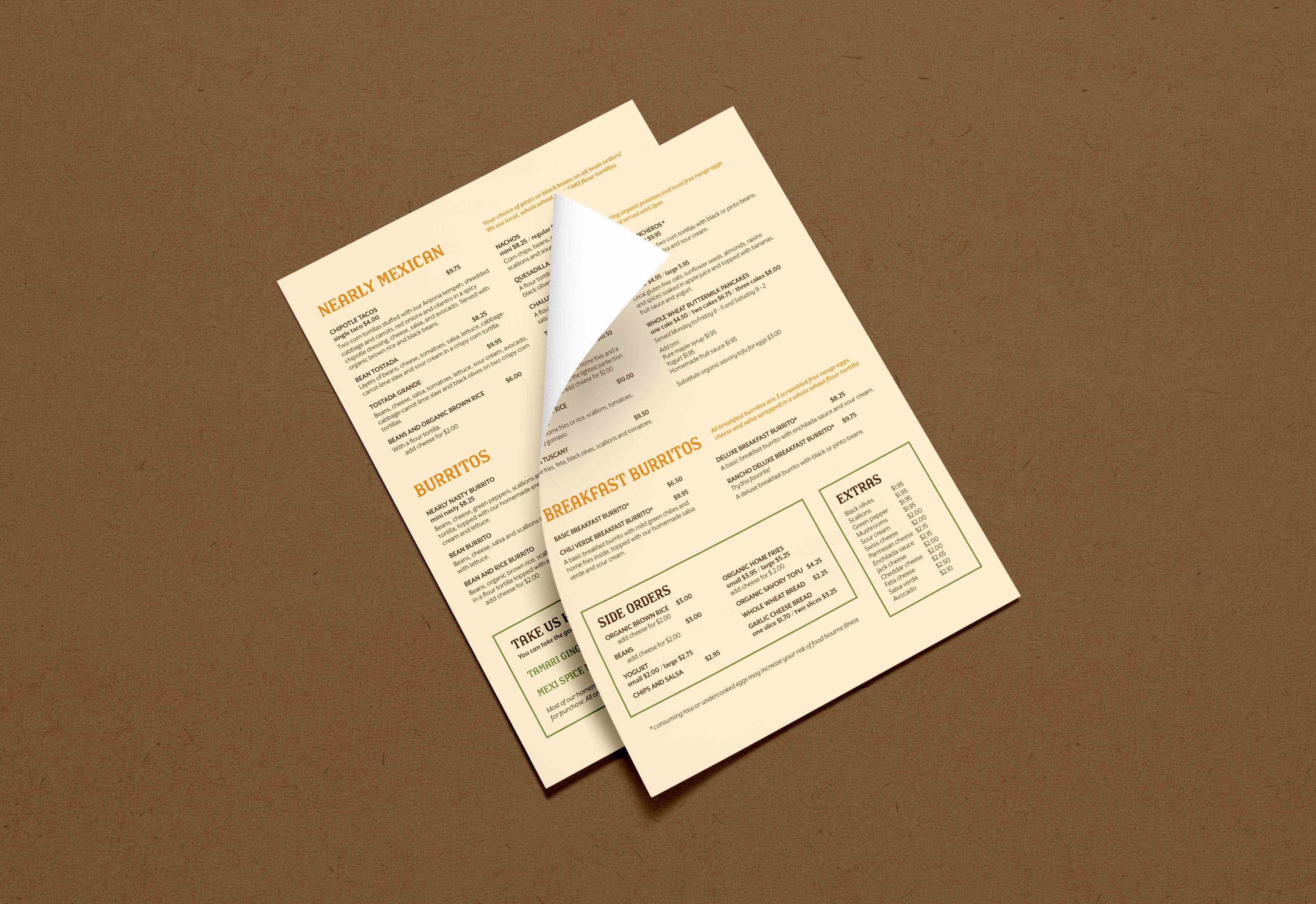
Check out my new brand guidelines here. And if you're ever in Corvallis, get the Nearly Nasty burrito.
Nearly Normal's
Branding, Illustration
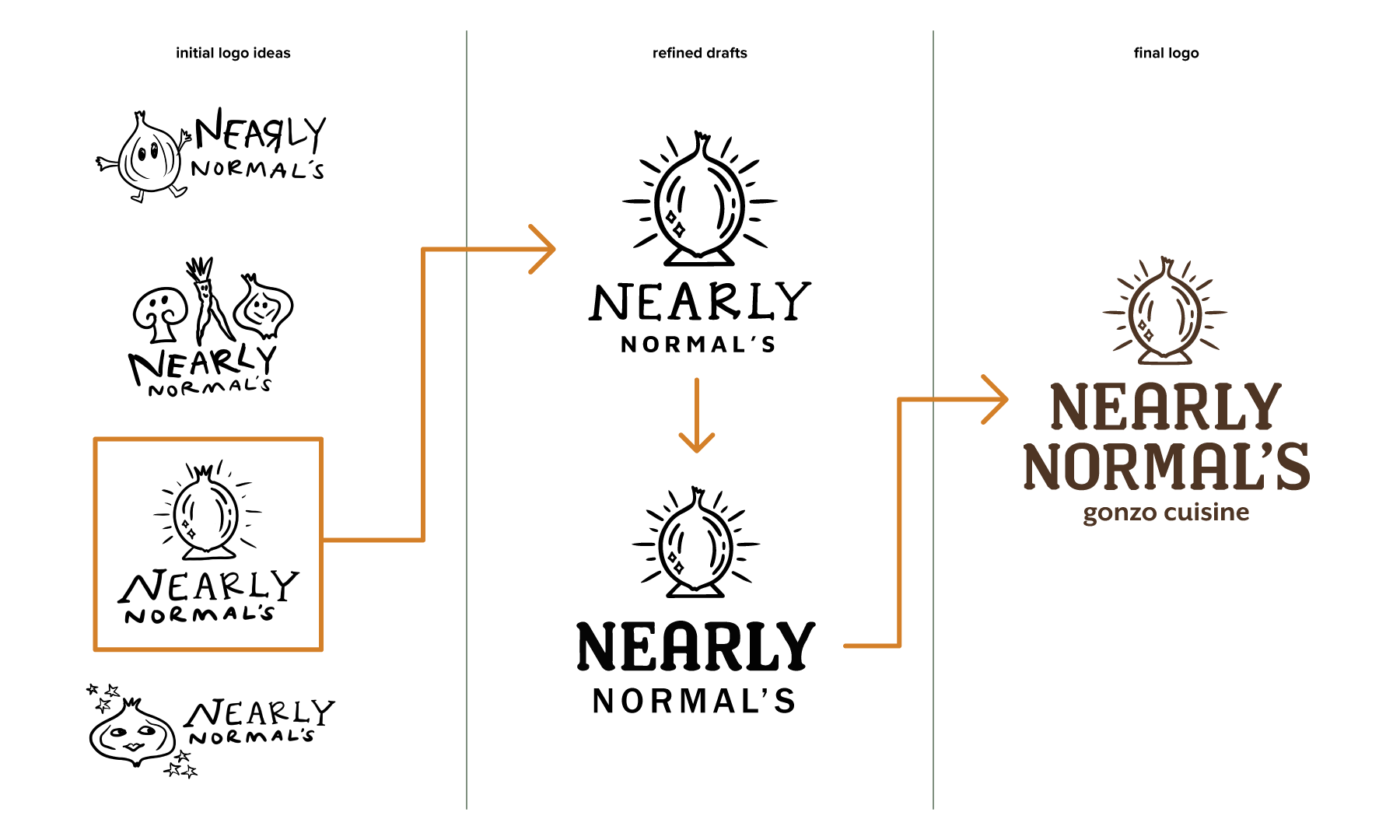
logo development